Thursday, 8 March 2012

EVALUATION QUESTION 3

What kind of media institution might distribute your media product and why?

The magazine industry in the UK is one of the biggest selling industries the UK has. Some circulation figures for music magazines are below:

    • The Fly free ( Channelfly Enterprises Ltd ) : 100,574 ; -0.4%
    • Mojo ( Bauer Consumer Media ) : 87,555 ; -7.5%
    • Q ( Bauer Consumer Media ) : 77,522 ; -12.1%
    • Classic Rock ( Future Publishing Ltd ) : 62,354 ; -7.9%
    • Uncut ( IPC Media Ltd ) : 62,305 ; -14.2%
    • The Stool Pigeon free ( Junko Partners Publishing ) : 53,676 ; N/A
    • Properganda free ( Proper Music Distribution ) : 46,542 ; N/A
    • Kerrang! ( Bauer Consumer Media ) : 42,077 ; -2.1%
    • DIY Magazine free ( RWD Creative Media Limited ) : 36,801 ; N/A
    • Metal Hammer ( Future Publishing Ltd ) : 35,259 ; -15.7%
    • New Musical Express ( IPC Media Ltd ) : 27,650 ; -14.0%

    Two main publishers for music magazines are IPC Media and Bauer Media. IPC Media publishes NME magazine, whereas Bauer publishes Q Magazine, both of which are two of the top selling music magazines. 

    Throughout my blog, I have compared my music magazine to mainly NME and Q, but coming down to what institution I would want to publish my blog, I would go for IPC Media.


    My magazine compared to NME is different, but bares some similarities. I've used the same basic colours on my magazine, as NME do on theirs, (red white and black). The use of a badge in the corner to advertise something inside the magazine too is similar. I used NME too for font ideas.

    However, the increasing number of magazine buyers tend to nowadays use the internet for their musical updates on news, gigs, concerts, festivals etc.. Therefore, the music magazine business is slowly decreasing, but not so much that there would be no business for them.


    Monday, 5 March 2012

    Front Page Analysis


    I used NME's cover of Jamie T and Rolling Stone's cover of Amy Winehouse as a sort of guide for my front cover, and took most of my ideas for what to put on my cover from both of these. My favourite out of the two was the Amy Winehouse issue, as the image and colour scheme went well together. Unlike Rolling Stone, NME tends to stick to the same colour scheme of red, black and white.

    Thursday, 1 March 2012

    EVALUATION ACTIVITY 2

    How does your media product represent particular social groups?


    I took two separate photos from two different magazines to achieve my final photo for my magazine. The first photo is of Billie-Joel from Greenday, and the second is of Florence Welch from Florence + The Machine
    .
    Both bands do have different genres of music, Florence + The Machine are a more alternative indie rock genre, whereas Greenday are a rock band.

    From both of the photos I put them together and created one which suited my genre for my magazine, which was indie rock. The pose I chose was considered more carefully and adapted to. The screaming affect in my opinion was a lot different than the original I found for it. 

    The posture of both photos are the same, both standing up and have similar hand gestures. I thought the body posture for my magazine represent indie rock more than Florence's, as you can actually see my model's faces and what expressions they are pulling, unlike hers.

    The lighting used for all photos is artificial lighting. With the artificial lighting I was able to edit out any blemishes and red eyes from my photo.

    The angle shot of my photo compared to the NME  magazine is different. The shot of Billie-Joel is looking down on him, whereas my photo is directly in front of my models.

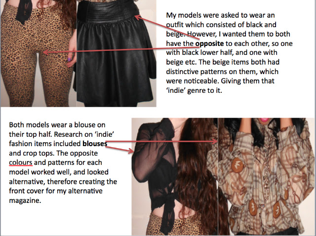
    The costumes of my models represent an indie rock genre, as they are different colours and unusual patterns, which is what a typical British Indie would wear. Bold patterns, light blouses, different materials etc. The clothes Florence Welch is wearing can only be viewed from the shoulders up. But from what I can see, she is wearing an unusual sequin dress made of different colours, which again fits the Indie criteria.

    No props for each photo are used, just hand gestures and facial expressions.

    EVALUATION ACTIVITY 1

    In what ways does your media product use, develop or challenge forms and conventions of real media products?

    The music industry is probably one of the most largest and ongoing businesses the UK has seen. The different genres and styles gives a variation of magazines to be published. From Kerrang!'s metal rock  to NME's alternative indie genre, the music magazine industry continues to exceed in the marketing business.

    The problems music magazines now face is the decreasing number of copies now being bought. The use of internet and websites now give readers a reason to not go out and buy a magazine.
    Recent circulation figures of current music magazines state so:

    Music (rock) circulation figures for the first half of 2011:
    Title; publisher; average sale; change year on year
    • The Fly free ( Channelfly Enterprises Ltd ) : 100,574 ; -0.4%
    • Mojo ( Bauer Consumer Media ) : 87,555 ; -7.5%
    • Q ( Bauer Consumer Media ) : 77,522 ; -12.1%
    • Classic Rock ( Future Publishing Ltd ) : 62,354 ; -7.9%
    • Uncut ( IPC Media Ltd ) : 62,305 ; -14.2%
    • The Stool Pigeon free ( Junko Partners Publishing ) : 53,676 ; N/A
    • Properganda free ( Proper Music Distribution ) : 46,542 ; N/A
    • Kerrang! ( Bauer Consumer Media ) : 42,077 ; -2.1%
    • DIY Magazine free ( RWD Creative Media Limited ) : 36,801 ; N/A
    • Metal Hammer ( Future Publishing Ltd ) : 35,259 ; -15.7%
    • New Musical Express ( IPC Media Ltd ) : 27,650 ; -14.0%
    • Hot Press ( Osnovina Ltd ) : 17,688 ; -0.2%

     Some elements for my music magazine were ideas taken from magazines such as NME and Q. The use of only 3 colours, including the colour red, was taken from NME magazine front covers. The body gestures and picture however was a slightly adapted idea from one of Q's past front cover. 
    The 'Indie' genre of my magazine is presented through the bands included on the magazine, and the fashion of the models.


    The music genre I chose for my magazine was 'alternative indie'.
    To achieve the genre, I had to think about what pose I wanted the models to do, and what clothes they had to wear.
    My final picture consisted of a different pose, with similar coloured clothes. 
    The pose I chose would be considered alternative and different.


    Link to

    My target audience for my magazine is anyone who is into alternative and indie music. Mainly I want people from the ages of 17-25 to read the magazine, as it would include things which interest them more than anyone else of another age. Although, anyone who is interested in this genre of music is who I am mainly aiming my magazine at.

    Monday, 27 February 2012

    Contents Page Analysis

    The idea for my main article picture on my contents page was taken from the July 2010 issue of Q Magazine. The picture which includes Matt Bellamy and Bono facing each other showed power. I took this idea and adapted to it, being more fun and not so serious.


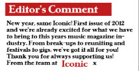
    Whilst analysing Kerrang!'s contents page, I saw at the bottom of the page that there was a little note from the editor. I liked this idea as it gave the magazine a friendly atmosphere, and that the editors and people who work for Kerrang! thought about what their readers wanted. This idea I took for my own magazine. 


    From NME magazine, to navigate someone to a certain part of the magazine, they used columns. This not only was a neat way in how to organise it, but looked professional too. I used this idea but changed the font and backdrop colour to suit the consistent style and colours used for my magazine.


    The enlarged page numbers on the main picture for my contents also was a good idea. By enhancing the size and using a drop shadow for the number, it immediately gets the readers attention and directs them to that page, which is the idea of the number.


    I took the idea of a 'Band Index' from NME contents page. The use of the band names in a small column on the side was not only relatively small but noticeable and gave a navigation for the magazine. The list of bands also gave you an idea of what genre the magazine was, due to what bands were included in the magazine. I used this idea for my own contents page but didn't include page numbers, just names of what bands were included in my magazine.

    Friday, 10 February 2012

    Contents Page Research

     The contents for Kerrang! gave me some ideas for my contents page. The headers such a 'News' and 'K! Quiz' with a highlighted background gave me a similar idea for my contents page, to put them into sections with headers. The main picture at the top of Slash caught my attention immediately and therefore I knew the main story was about that. The layout of the contents page definitely gave me some ideas for my own contents page, but the colour scheme with the black, yellow and white in my opinion didn't go well. The editor's comment on the side was a good touch to it, and the picture to go with it showed an interest for the readers.

     Immediately I liked the 'band index' on the NME contents page, and the 'This Week' heading too, so I took ideas from this for my contents page. Again, the same as Kerrang! the sub-titles had a back colour against the title, and was set into columns. The block writing with a bold background got my attention quickly as the colours went well together, showing that the layout and ideas of the contents page came together well. The subscribe column at the bottom of the contents used a different colour, (yellow), so it came across as noticeable for the readers. This again attracted my attention therefore fulfilling it's purpose.
    The main picture on the contents caught my attention, along with the large and identifiable page number to the side of it. This is where I got the idea for my page numbers. The idea of the main photo in the corner to me was a good idea for my contents page too. The attraction to the picture immediately made me turn to the page the picture was from, which was the affect I wanted for my contents page to have. I also liked the way underneath each mini title that there was a small description of what was on this page, which gave it a small summary. Again, I took this idea for my contents page.


    The main contents picture I really liked the idea of. Matt Bellamy and Bono's pose caught my eye. The way they are facing eachother showed a power they both had, so I took this idea and adapted from it. I really like how Q lay out their contents page, with the banner at the top identifying the magazine name and the headers for what section of the contents is what.