

 The idea for my main article picture on my contents page was taken from the July 2010 issue of Q Magazine. The picture which includes Matt Bellamy and Bono facing each other showed power. I took this idea and adapted to it, being more fun and not so serious.
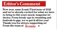
Whilst analysing Kerrang!'s contents page, I saw at the bottom of the page that there was a little note from the editor. I liked this idea as it gave the magazine a friendly atmosphere, and that the editors and people who work for Kerrang! thought about what their readers wanted. This idea I took for my own magazine.

 From NME magazine, to navigate someone to a certain part of the magazine, they used columns. This not only was a neat way in how to organise it, but looked professional too. I used this idea but changed the font and backdrop colour to suit the consistent style and colours used for my magazine.
 The enlarged page numbers on the main picture for my contents also was a good idea. By enhancing the size and using a drop shadow for the number, it immediately gets the readers attention and directs them to that page, which is the idea of the number.

I took the idea of a 'Band Index' from NME contents page. The use of the band names in a small column on the side was not only relatively small but noticeable and gave a navigation for the magazine. The list of bands also gave you an idea of what genre the magazine was, due to what bands were included in the magazine. I used this idea for my own contents page but didn't include page numbers, just names of what bands were included in my magazine.
No comments:
Post a Comment